
Sample Chapter: Designing Assistant Technology
This is a sample chapter from Christopher Noessel‘s book Designing Assistant Technology: AI That Makes Us Smarter. 2026, Rosenfeld Media.
Chapter One
Google Maps as a Bejeweled Crutch
I grew up in Houston, Texas. If you’re unfamiliar with the city, one of its defining features is the sheer number of roads. It sits on a gently sloping coastal prairie, to the west of a little pocket of a bay connecting it to the Gulf of Mexico, and other than the coast itself, it has no other natural boundaries. As the city expanded over the decades to its current 100-mile radius, land was readily available, and roads were easy to build. And build they did.
Filling its 640 square miles are nearly 12,000 lane-miles of road. That means if you could break up the roads into individual lanes, straighten them all out, and lay them end to end, they would stretch from Lima, Peru, almost all the way around the world to Bangkok, Thailand. At some points along its stretch, the Katy Freeway, including its frontage and toll roads, is a shocking 24 lanes wide. If you added up all the miles driven by people living or commuting there, it comes to over 106 million miles traveled each typical workday. It’s a lot of roads with a lot of traffic (see Figure 1.1).

Figure 1.1
Houston’s “Spaghetti Bowl.” Somehow the satellite view makes it seem less confusing.
As a tween, I recall riding in the back seat of my dad’s car, looking out the window as we drove over “the spaghetti bowl” (Figure 1.2), a stretch of complicated freeway entrances and exits where Allen Parkway and Memorial Parkway meet, and being baffled by it all. I knew that I was supposed to navigate it by myself sometime in the next few years, when I got my driver’s license. That felt daunting. I asked my dad, “How did you learn all these roads?” He thought for a minute, as I recall, and said something like, “You just start out knowing a little bit of it and go from there.”
Years later, when I got my license and began to drive, I realized he was right. I first mastered getting from home to high school and back. Then I learned branches off that main path that took me to friends’ houses, fast-food joints, movie theaters, and grocery stores. I even went to Westheimer Street near downtown to see if “cruising the strip” was worth it. (It wasn’t.)
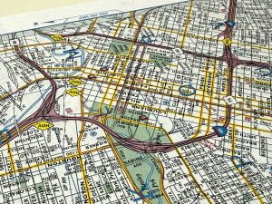
Figure 1.2
Photograph by the author, of the same intersection shown in Figure 1.1.
When I needed to get somewhere new, I’d pull out a thick spiral-bound book of street maps of the city called a Key Map. (They are still in business as of the time of this writing.) Using its huge index, you could look up an address, cross-reference to find where that address exists in a grid on a page, find the exact location in the grid, and then figure out how to get from where you were to your destination, often having to connect routes across several spreads. This particular reference was bit of a hassle, but it worked, and I’d hazard that within about six months of using it, I had built a solid working mental model of the major freeways and neighborhoods of the city, which served me well for the remaining decade I’d live there.
Fast forward to 2003, and I found myself in San Francisco. The Bay Area has its own share of roads. But as a city on a peninsula, bounded on three sides by water, and only 47 square miles, it should have been easier. The paths may be more complicated by the coastline of the bay and bridges, its islands and hills. But sometime around 2013, I realized that even after ten years here, I still didn’t have as rich a mental model of the roads and neighborhoods as I had built in six months in Houston using that ungainly paper map system. I found myself wondering why.
Sure, the Bay Area has a functioning public transportation system and zoning laws. As a result, it is much more walkable than Houston, so I wasn’t driving as much. And I was in my 30s, rocking less of the information-sponge brain I had in my late teens. But I also had a suspicion that technology had played a major role here.
Enter Google Maps
Google Maps came out in 2005, and for the two years that it was just limited to a website, I’d look up my destination and print out the route with turn-by-turn instructions, like a just-in-time Key Map that was customized for me and my trip. It was a personalized reference, saving me the hassle of destination-finding and route-making.
When Google Maps was included on iPhones in their debut in 2007(see Figure 1.3), it stopped being a reference and became an assistant. That is, it was able to help with the navigation task while the task was underway. I adopted it immediately and stopped printing routes out, enjoying the ability to enter a destination and get real-time instructions on what to do. (Real-time traffic wasn’t added until late 2012.) The maps were well-designed, the data for the Bay Area was rich and accurate, and the interactions seamless. I could just enter a destination and zone out.
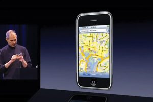
Figure 1.3
Steve Jobs demonstrates the use of Google Maps on the original iPhone in 2007.
But using the app this way also meant that I didn’t have any incentive to memorize the road system. To internalize it. Back in the day, spending half an hour figuring out a route in a Key Map was enough of a hassle that I wanted to learn it as fast as possible. Google Maps didn’t have that friction. It gave me what I wanted, and that was, in one sense, the problem.
Putting Numbers to the Problem
In 2019, I led the Design for AI guild within IBM, where I started a working team to focus specifically on this question. Is technology in general—and AI in particular—de-skilling us? Is it making us dumber and more dependent? If so, can designers do anything about it?
I told this story—of the differences between learning the two cities—to the small team I had assembled. Everyone agreed that they had experienced similar things in their lives. So, our next step was to take it out of the realm of anecdote and see if we could test it—to demonstrate the effect in numbers.
To do this, I built a virtual-commute prototype in the software design tool Figma (see Figure 1.4). Readers familiar with technology history will recognize echoes of MIT’s Aspen Movie Map from 1976. Figma imposed some significant constraints, like not being able to play sound, but it’s what I had to work with. The prototype modeled a route in Seattle from the upscale Hunts Point neighborhood, across the State Route 520 bridge over Lake Washington, into the downtown core to the Experience Music Project near the Space Needle. It would allow a few “bad turns,” but users could not get too far off the route before hitting the limits of the prototype.
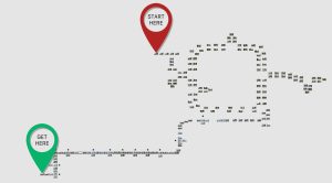
Figure 1.4
Figma shows an overhead view of each node in the prototype route.
At each decision point, users saw a street view with arrow buttons along the bottom that indicated directions they could travel, like left, forward, right, or U-turn (Figure 1.5). Clicking a button would play a series of street views that illustrated their “driving” to the next decision point. In the upper left-hand corner was a virtual phone displaying a comped-up Google Maps with its familiar blue line indicating the route, along with the standard green section at the top that displayed the next instruction.
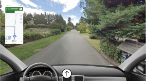
Figure 1.5
A view of the prototype, showing a virtual Google Maps route, a street view, and the decision available to the commuter. This is the start, so the only option is to move forward.
We put out a call for participants across the company, and in short order had a dozen or so IBM employees from around the world who agreed to take short “daily commutes” for a working week. The first four days were all the same: A facilitator from the team would greet them on a video call, begin recording, and our participant would use the prototype with the virtual Google Maps assisting them to get from the starting point to the Space Needle. Once they arrived, the facilitator would stop the recording, thank them, and remind them of their next commute. Sessions took less than 15 minutes.
On the fifth commute, though, we sprung a surprise on them. After the facilitator greeted them, they told the participant that there was some bad news; their virtual phone was broken, and no instructions were available (see Figure 1.6). They would need to make the commute from memory. This version of the prototype was identical to the first, except there was no floating phone” on screen. We pressed record, and they would be off.
Figure 1.6
Good luck with that.
The route was not that complicated, having only 12 decision points. We didn’t expect that many wrong turns in the unassisted commute. Instead, what we measured was decision times. Looking at the recordings, we documented the seconds between when the decision screen loaded and when a decision was made. This would be a good indicator of their confidence. Fast decision times would indicate high confidence, and slower decision times would indicate lower confidence. Using this metric, we expected to see a performance collapse between days four and five, illustrating the effect of dependence.
That’s exactly what we saw. The average time for decisions on day four was 02:57 seconds. On day five, their hesitations and uncertainties lengthened that average to 04:02 seconds, or 48% more time at each decision point. The control group had effectively demonstrated that Google Maps had assisted them to get to their destination for four days, but in that time it hadn’t helped them learn it at all.
We had a number for the effect of the crutch—48%. There are a number of good reasons to be skeptical of this number (and I hope someone does some more and better research on this in the future), but if we’re even in the ballpark, that’s pretty unsettling.
If all technology does something like this, what are we doing to ourselves?
This story does have a happy ending, but I need to save that for Chapter 2, “Will Assistants Doom Us to ‘Stupidity’?” For now, I want to note that despite this finding, I’m not saying that Google Maps is badly designed. I’ve been in software design for over 30 years. I lean on that experience to say that Google Maps is very well-designed. (At least in the commonly understood scope of that term.)
Consider how it assists: It can help you look up and even disambiguate a destination address in seconds. It finds the best route from a huge number of possible routes, taking into consideration your preferences and current traffic. It provides an overview of your route and then walks you through each step and will automatically reroute you if you take a turn off the suggested route. En route it constantly checks traffic conditions, and if it finds a shorter route because of changing conditions, it will offer it to you as an alternative.
It has some ad-like prioritization of landmarks, i.e., turn left at the Church’s Chicken, so is a little enshittified (to use Cory Doctorow’s fantastic term), but it’s not over the top. It never feels like that overwhelms the experience. Map displays can be dense bricks of information, but the visual design here makes it legible at a glance, even while driving up to freeway speeds. It has a memory, so familiar destinations are easy to select. It provides both an overview for long-term understanding of the route and a concrete next steps with road names, lane suggestions, and icons for telegraphing turns. It has a turn-by-turn display mode for drivers who prefer that. It has
multiple audio modes for silence, only hearing traffic-based updates on familiar routes, and turn-by-turn audio for unfamiliar routes. It provides drivers with real-time traffic information via color coding, sets expectations by letting drivers know how long slow patches are predicted to last, shows icons along the route to highlight common roadside incidents, and gives the option to submit any incidents that you find. In my years of using it, the predicted arrival time has always been eerily precise.
With all these features, you might think it could be overwhelming, but, no, it feels straightforward. It’s easy to use. If you’re a frequent user, you might even have forgotten it does all this stuff, and that’s a testament to how well-designed it is. It just works. It’s a highly usable assistant.
And usable is important. But when you start looking at the bigger picture, usable is no longer enough. Because you need technology to also not make you dependent, de-skilled, or stupid, even while it’s assisting you to do more than ever before.
