I’m sorry to break this to you, but your life is about to change.
I know this because of a study we conducted years ago when we had the opportunity to observe Master Cabinetmakers. What does building kitchen cabinets have to do with designing forms in an online application? Let me explain…
The purpose of our study was to look at the difference between those who do mediocre work and those whose work is excellent. We picked a variety of trades to study, where we could find people who were true masters. We wanted to see the differences between the masters’ work and those of people whose skills weren’t as refined.
This brought us to cabinetmakers. Cabinetry is a very old craft, and the people who master it are amazing in their talents and skills. They can create something that is both useful and beautiful. The best are aware their products are only a piece of the overall décor and know how to blend their results perfectly into the surrounding experience. After all, when we’re in the kitchen, it’s about the cooking and the family interaction—not about eternal admiration of the dovetail joints holding the utensils in place.
One of the biggest takeaways from our research was the carpenters’ extreme attention to detail. Even though each person we interviewed had years of experience, nothing was taken for granted. Every hinge and joint was finely crafted, almost as if it were the most important element in their entire career. The pride they took in the final cabinet was the sum of the pride they took in each individual element.
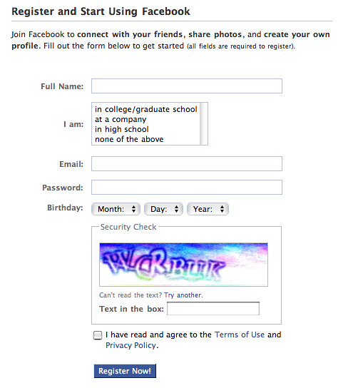
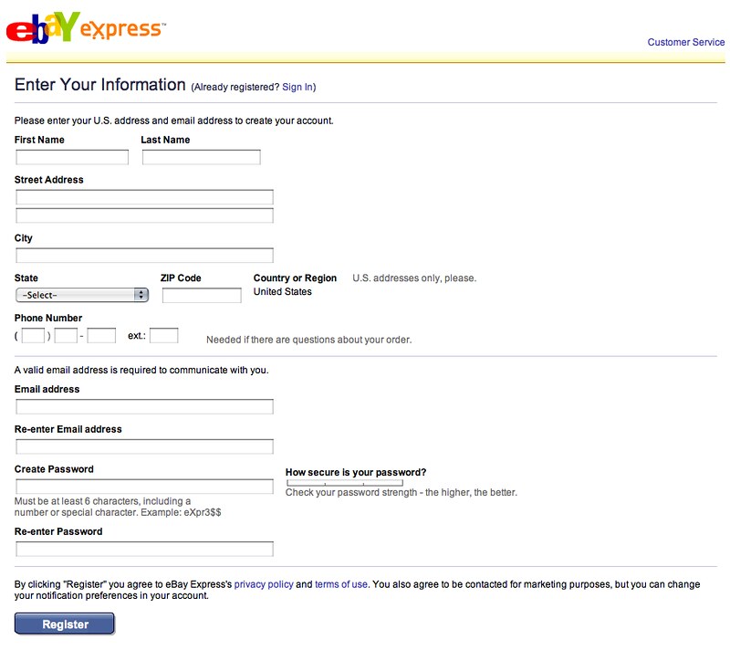
Cabinetmakers aren’t the only folks who behave this way. So are the master craftsmen of our own field, like Luke Wroblewski. In this book, Luke applies that same loving attention to detail to the design of Web forms. Like the cabinetmakers, his masterwork is both useful and beautiful. But unlike many craftsmen, Luke is willing to share his secrets outside the guildhall.
You are about to learn the secret element of making great forms and, once you start applying this knowledge, you’ll also realize that the perfection of the online experience comes from the sum of the perfect form elements and flows that go into it.
This is what will change your life: the new appreciation of how subtlety and nuance in form design can have dramatic overall effects on the total online experience (and your bottom line). And, once you learn to control those subtleties and nuances, you, too, will be a master of your craft.
As I said, your life is about to change. It starts right … now!
Jared M. Spool
Founding Principal, User Interface Engineering